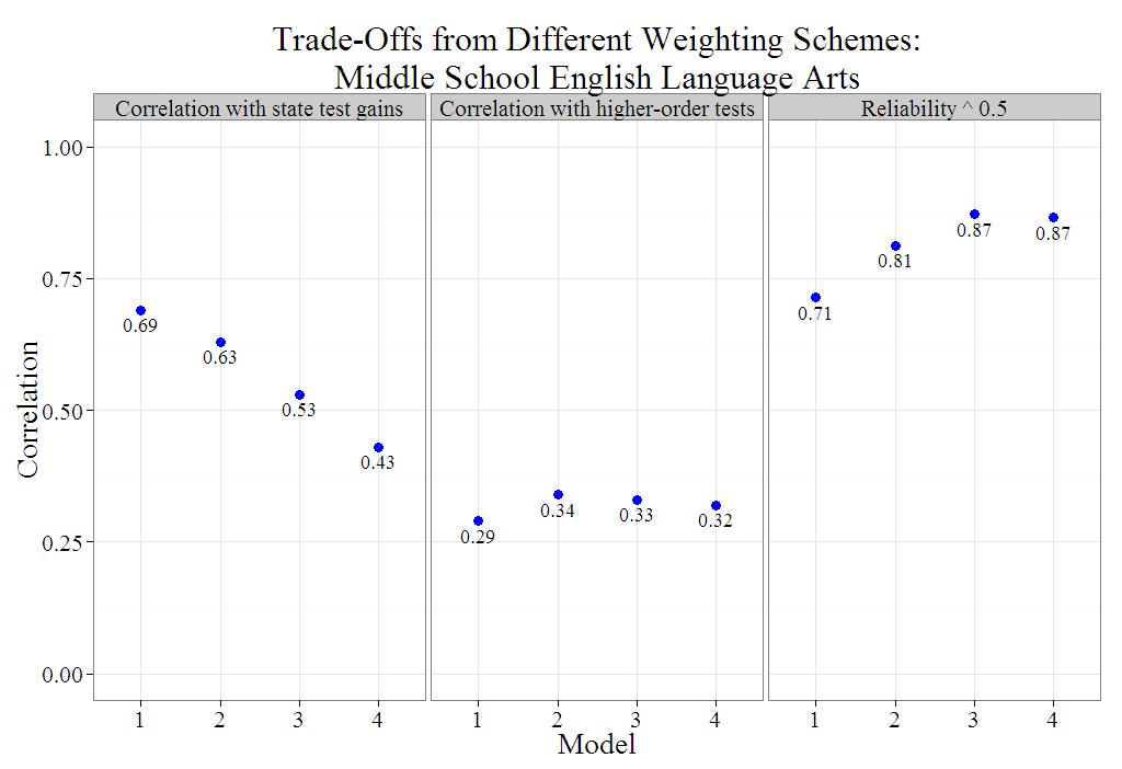
I came across the following plot while reading “Ensuring Fair and Reliable Measures of Effective Teaching“.
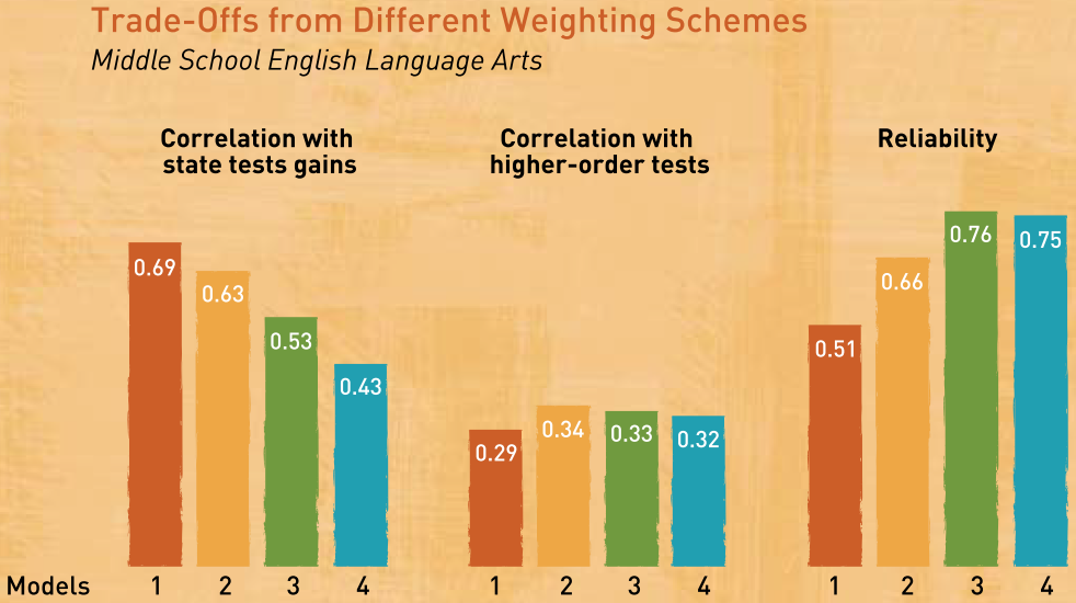
Maybe I’ve spent too much time reading Andrew Gelman’s blog because I noticed two issues with the plot that could be improved. The most serious issue is that the first two sets of bars display correlation coefficients, but the last set of bars displays squared correlation coefficients. It doesn’t matter that the first two sets represent a type of validity and the last represents reliability. What matters is that the bars incorrectly imply a common scale for the entire figure and could mislead readers. Perhaps the authors made the somewhat common mistake of assuming that a reliability coefficient is a correlation coefficient because both are denoted r? It’s probably just a graphic design mistake that the authors didn’t catch. The second issue I noticed is far less serious (and is debatable). Since the bars do not represent counts, the coefficients should be displayed as dots.
I used ![]() to create an improved (but less colorful) version of their plot that displays only correlation coefficients with dots instead of bars. The new version shows more clearly that each variety of teacher effectiveness composite score “predicts” itself (from a test-retest perspective) better than any of them predict the criteria. In other words, the improved plot illustrates how score reliability is a necessary but insufficient condition that can act as a ceiling on validity.
to create an improved (but less colorful) version of their plot that displays only correlation coefficients with dots instead of bars. The new version shows more clearly that each variety of teacher effectiveness composite score “predicts” itself (from a test-retest perspective) better than any of them predict the criteria. In other words, the improved plot illustrates how score reliability is a necessary but insufficient condition that can act as a ceiling on validity.