Pollster, my addiction

Election day is only six weeks away. I grew dependent on Pollster.com during the primaries. Now I have a full-blown addiction.

I like Pollster because it’s run by professional survey researchers who pay attention to sampling error, nonresponse bias, and other threats to making accurate inferences about the electorate’s preferences. They have sought to offset some of those threats by mashing up survey results from many reputable sources and running a smoothed trend line through them. Additionally, they critically review results and methods, pointing out strengths and shortcomings that poll consumers can use to evaluate results.

Posted in Personal | Comments Off on Pollster, my addiction

Spatial analysis of math proficiency in third grade

Is student proficiency in a school district related to proficiency levels in neighboring districts? I’m continuing my foray into spatial methods by analyzing spatial dependency among standardized test scores at the school district level in Minnesota. If the influence of neighboring school districts is significant, then district performance could be evaluated in a manner that controls for the influence of neighbors (e.g., with a spatial lag model expressed as y = ρWy + + ε). Additionally, we could single out school districts that exceed expectations, where expected performance is predicted by neighbors.

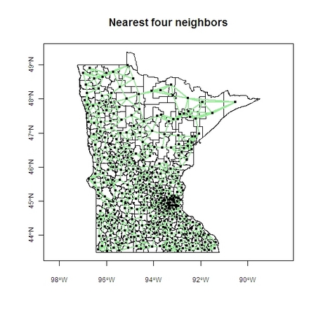
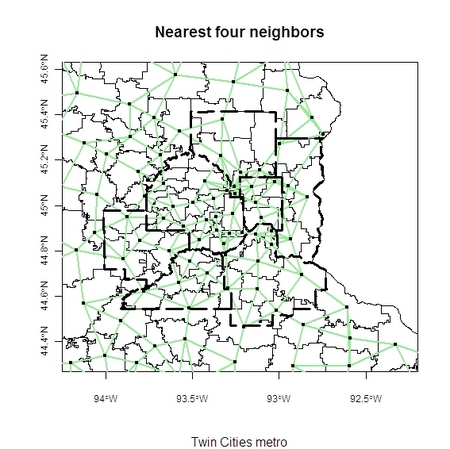
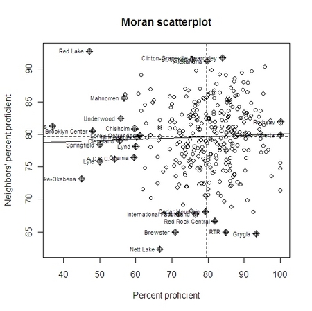
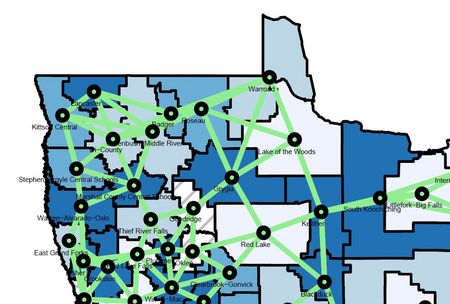
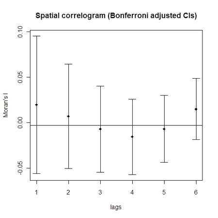
The following maps show third grade math proficiency in 2007 and each district’s four nearest neighbors. As shown in the spatial correlogram, the percentage of students in Grygla Public Schools exhibiting proficiency is greater than the percentage in neighboring districts. The same is true for other districts in or near the bottom right quadrant. Districts in or near the top left quadrant, such as Brooklyn Center and Red Lake, are not faring as well as their neighbors. Note that Grygla and Red Lake are neighbors, their proficiency levels differ greatly, and they border districts with missing test score data (i.e., their spatial lags are weighted by three instead of four neighbors), all of which help explain why they are positioned as outliers in the correlogram.

Overall, there’s a lack of evidence that this particular district outcome (percent of third graders proficient in math) is influenced by neighboring districts or nearby districts (out to six lags). The spatial correlation coefficient, Moran’s I, is not significantly different from zero. Future analyses will investigate spatial dependency of other indicators of student and district achievement, such as reading proficiency, proficiency gaps (economic and racial/ethnic), and proficiency by grade level.
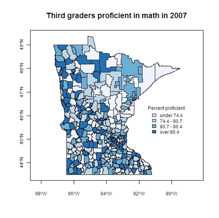
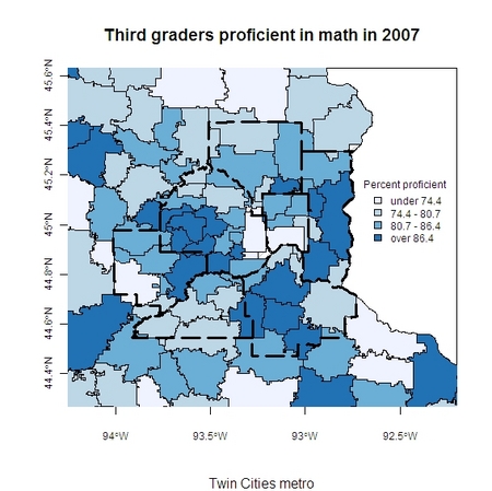
Third graders proficient in math in 2007 choropleth.jpg

Third graders proficient in math in 2007 choropleth Twin Cities.jpg

Minnesota school district neighbors.jpg Twin Cities school district neighbors.jpg

Third graders proficient in math in 2007 Moran plot.jpg

Grygla and Red Lake juxtaposed
Grygla_Red_Lake_zoom.jpg

Third graders proficient in math in 2007 Moran correlogram.jpg

Moran’s I test

Moran I statistic standard deviate = 0.6023,
p-value = 0.547
alternative hypothesis: two.sided
sample estimates:
Moran I statistic 0.019742685
Expectation -0.003058104
Variance 0.001433003
Posted in Praxes | Comments Off on Spatial analysis of math proficiency in third grade

My Old Kentucky Home

Here are some pictures from my visit to Kentucky in August.

Shaker Village
Picture 019.jpg

Sorghum
Picture 043.jpg

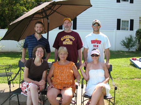
Family reunion
IMG_9093.jpg

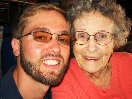
Rest in peace, Granny
IMG_9068.jpg

Posted in Personal | Comments Off on My Old Kentucky Home

The life of an applied researcher

Check out the first deleted scene from The Simpsons Movie. It’s really funny and deftly portrays what it can be like to conduct applied research in the policy arena. The head of the EPA fails to persuade President Schwarzenegger to take action on pollution in Springfield and resorts to giving a lesson on the statistical concepts of central tendency, variance, and outliers. In the end, a “stupidly high level” of pollution proves less persuasive than one mutant specimen. The takeaway: data collection and statistical analysis can strongly suggest a course of action, but applied researchers must also consider what types of information will resonate with their audience if they hope to inspire appropriate action. Presenting tabular information in maps, for example, can give statistics more meaning. Another takeaway: technocracy is funny.

Posted in Praxes | Comments Off on The life of an applied researcher

Workshop on quasi-experimental design and analysis in education

I recently attended one of the Workshops on Quasi-Experimental Design and Analysis in Education. The workshop was led by two of my heroes, Thomas Cook and William Shadish. It was an honor to be selected for the workshop and to share the company of Tom, Will, and my fellow attendees for a week in Evanston. I had some experience with quasi-experimental methods before the workshop, but I learned a great deal more, such as checking propensity score balance criteria and mixing design elements to strengthen causal inferences. The workshop definitely improved my ability to conduct causal research in education.

Tom, me, and Will
Picture 118.jpg

View from Northwestern University
Picture 113.jpg

Camping at Illinois Beach State Park after the workshop
Picture 003.jpg

Posted in Praxes | Comments Off on Workshop on quasi-experimental design and analysis in education