A reader who is studying political science at the University of Chicago asked me how I plotted the regression discontinuity simulations in my previous blog entry. Here’s a reproducible example for those of you conducting regression discontinuity analyses with ![]() :
:
#Randomly sample from X~N(0, 100) and conveniently use mean cutoff to maximize power and bypass centering.
set.seed(100)
x <- rnorm(200, 0, 10)
z <- ifelse(x<0, 1, 0)
tx <- which(z==1)
#Randomly sample from T~N(50, 100) and specify the regression function.
set.seed(101)
y <- rnorm(200, 50, 10) + 10*z + 0.5*x - 0.025*x^2 #1 σ effect size
#Plot the observations and regression lines.
plot(y ~ x, col=NULL, xlab="Assignment", ylab="Outcome", ylim=c(min(y)-10, max(y)+10))
abline(v=0, lty=2, lwd=2, col="darkgrey")
points(x[tx], y[tx], col="darkgrey", pch=4)
points(x[-tx], y[-tx], col="darkgrey")
curve(50 + 10 + 0.5*x - 0.025*x^2, min(x)-10, 0, add=T, lwd=2)
curve(50 + 0.5*x - 0.025*x^2, 0, max(x)+10, add=T, lwd=2)
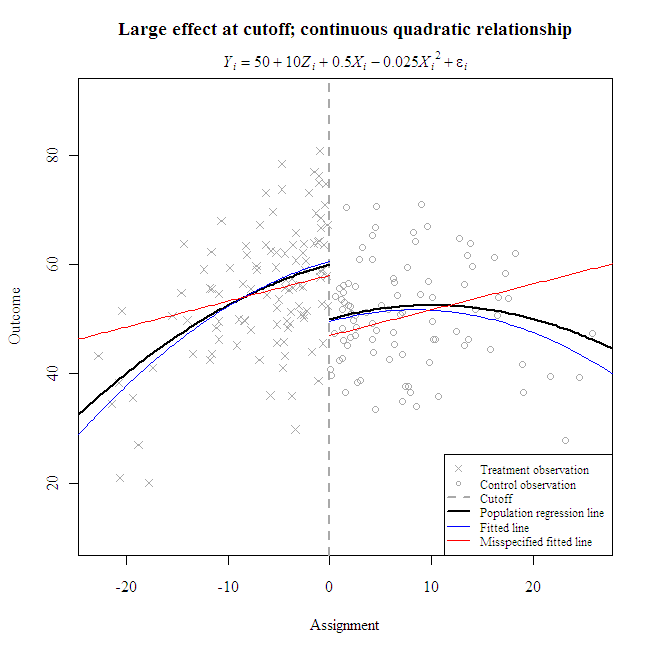
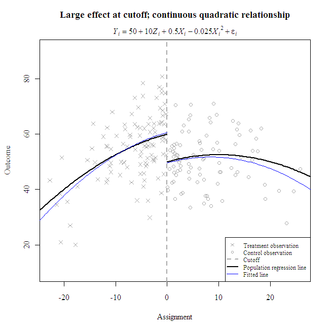
title(main="Large effect at cutoff; continuous quadratic relationshipn")
mtext(expression(italic(Y[i]) == 50 + 10*italic(Z[i]) + 0.5*italic(X[i]) - 0.025*italic(X[i])^2 + italic(epsilon[i])), line=.5)
I prefer to plot lines with curve() instead of predict() when the regression equation is simple. The former only requires coefficients and produces nice smooth curves; the latter requires a data frame and may result in jagged lines but is well-suited for lengthy equations with many interactions. Here’s a way to plot fitted lines with parameter estimates from lm():
#Fit a regression discontinuity model.

model <- lm(y ~ z + x + I(x^2))

print(xtable(model), type="html")
| Estimate | Std. Error | t value | Pr(> |t|) | |
|---|---|---|---|---|
| (Intercept) | 49.5272 | 1.4028 | 35.31 | 0.0000 |
| z | 11.1037 | 2.1343 | 5.20 | 0.0000 |
| x | 0.5231 | 0.1173 | 4.46 | 0.0000 |
| I(x^2) | -0.0311 | 0.0055 | -5.67 | 0.0000 |
#Add the fitted lines and legend.

coefs <- coefficients(model)

curve(coefs[1] + coefs[2] + coefs[3]*x + coefs[4]*x^2, min(x)-10, 0, add=T, col="blue")

curve(coefs[1] + coefs[3]*x + coefs[4]*x^2, 0, max(x)+10, add=T, col="blue")

legend("bottomright", bg="white", cex=.75, pt.cex=.75, c("Treatment observation  ", "Control observation", "Cutoff", "Population regression line   ", "Fitted line"), lty=c(NA, NA, 2, 1, 1), lwd=c(NA, NA, 2, 2, 1), col=c("darkgrey", "darkgrey", "darkgrey", "black", "blue"), pch=c(4, 1, NA, NA, NA))
Note the decreasing accuracy of predictions further away from the cutoff, where fewer observations lie.
What happens when one misspecifies the functional form? In the following example, the linear misspecification poorly represents the true conditional mean, especially beyond the cutoff. However, the local effect size estimate (i.e., at the cutoff) compares favorably to the estimate from the correct specification. Both have overestimated the true local effect by about one-tenth of a standard deviation.
#Fit a misspecified regression discontinuity model.

model <- lm(y ~ z + x)

print(xtable(model), type="html")
| Estimate | Std. Error | t value | Pr(> |t|) | |
|---|---|---|---|---|
| (Intercept) | 46.9717 | 1.4296 | 32.86 | 0.0000 |
| z | 11.0570 | 2.2969 | 4.81 | 0.0000 |
| x | 0.4742 | 0.1259 | 3.77 | 0.0002 |
#Add the fitted lines to the first plot and update the legend.

coefs <- coefficients(model)

curve(coefs[1] + coefs[2] + coefs[3]*x, min(x)-10, 0, add=T, col="red")

curve(coefs[1] + coefs[3]*x, 0, max(x)+10, add=T, col="red")

legend("bottomright", bg="white", cex=.75, pt.cex=.75, c("Treatment observation ", "Control observation", "Cutoff", "Population regression line ", "Fitted line", "Misspecified fitted line"), lty=c(NA, NA, 2, 1, 1, 1), lwd=c(NA, NA, 2, 2, 1, 1), col=c("darkgrey", "darkgrey", "darkgrey", "black", "blue", "red"), pch=c(4, 1, NA, NA, NA, NA))